Visualize the data
During a simulation, it is possible to visualize the data as
Graphs or in a
Sensor table
1 Graphs
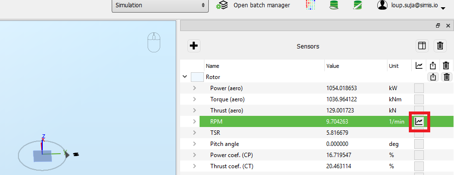
The data obtained during a time simulation can be visualized live while the simulation is running. In order to visualize the data, check the box next to the selected field, as shown in the figure below.
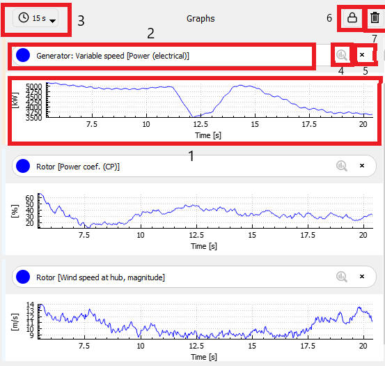
- Graph area: the data is plot here. If the y-axis is unlocked (see point 6), you can zoom in and out of the graph bu scrolling with the mouse
- Graph name: the name contains the sensor (in this example 'Generator') and the output ('Power (electrical)'). You can superimpose a graph onto another one by clicking on its name and dragging it onto the other graph. Note that this is only possible for output with the same units.
- x-axis range: clicking this icon opens a dropdown menu where you can adjust the x-axis range of the graph. It is possible to define a custom range by selecting 'custom time'
- Display statistics: clicking this button will display the statistics corresponding to this graph: minimum, maximum, mean and standard deviation. By default the statistics are clculated from t = 0, but you can select the starting time in the Analysis parameters.
- Close graph: this button closes the corresponding graph
- Lock y-axis: if the lock is closed (i.e. default value), the y-axis range is defined automatically so that all the data is visible in the graph. When clicking the icon, the lock is opened and you can define the y-axis range by scrolling with the mouse
- Close all graphs: closes all the graphs
2 Sensor table
The
Sensor table view
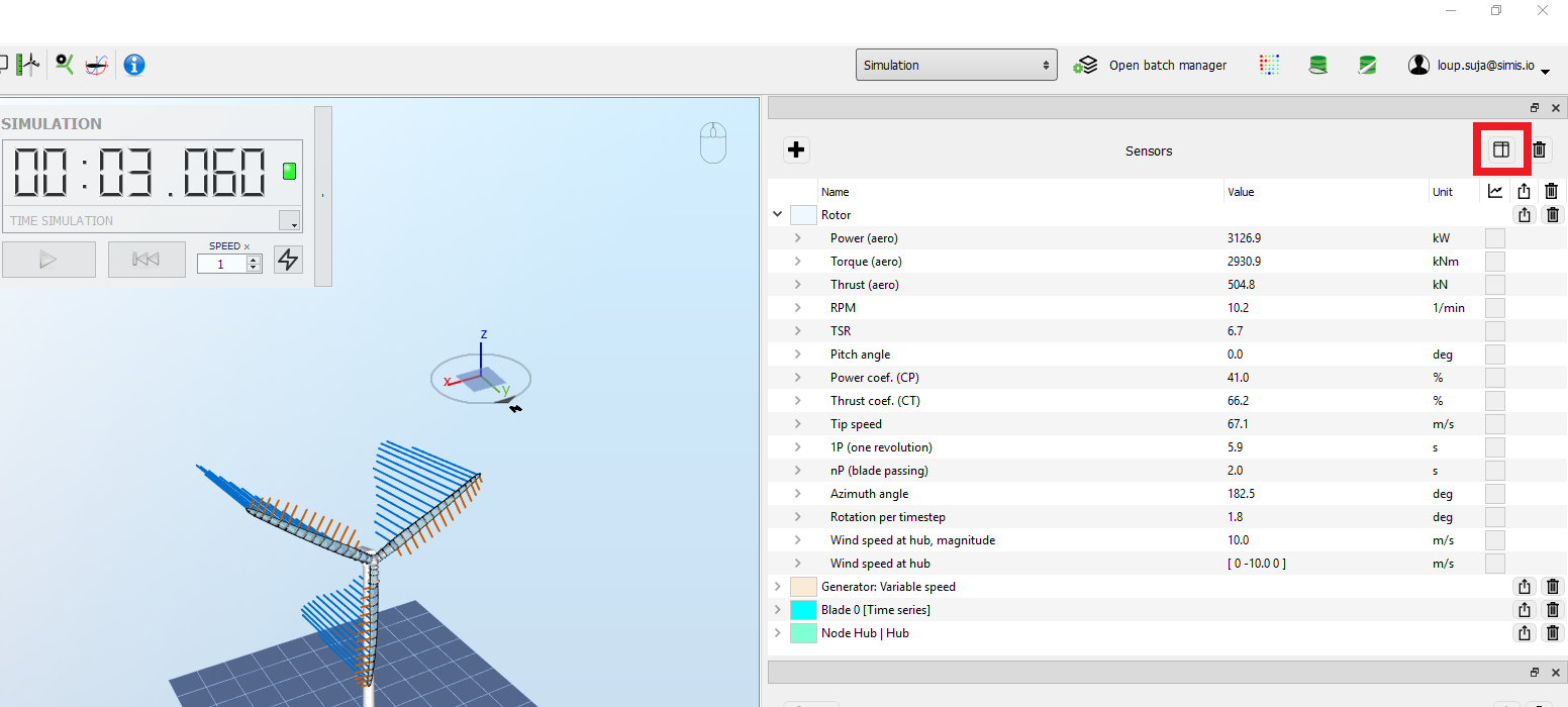
can be opened by clicking the icon highlighted in red in the picture below
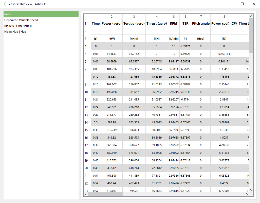
This will open a window with all the data recorded during the simulation, as shown in the picture below. The left pane of this window allows you to navigate between the different sensors used in the simulation.
3 FFT
It is also possible to plot the FFT of any field during a simulation, by right-clicking the field and selecting
Add frequency spectrum graph, as shown in the figure below:
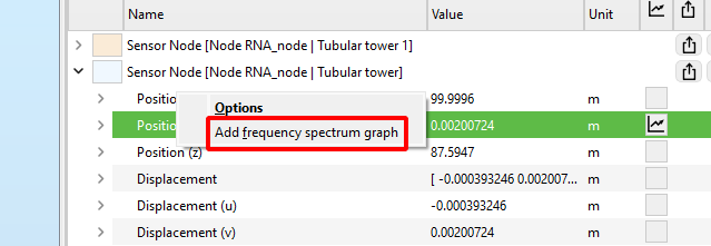
The x-axis in the FFT graph corresponds to the frequency in Hertz, the y-axis is the amplitude of the FFT components divided by the next power of 2 of the number of samples.
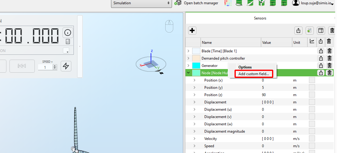
4 Custom field
it is possible to generate a graph where the x-axis is a field of a given sensor, rather than time. This can be useful for example to plot a variable from the Rotor sensor against azimuth angle, or an x vs y graph of the displacement of a node.
Note: it is only possible to plot a graph where the variables in the x and y axes come from the same sensor. For example, you cannot plot the
Generator power (from the generator sensor) against the
Azimuth angle (from the Rotor sensor)
To plot such a graph, you need to create a
Custom field by right clicking the name of the sensor in the sensor pane (or any fiels from the sensor) and select
Add custom field, as shown in the figure below:
You will then be prompted with a dialog with the settings of the new field and its graph:
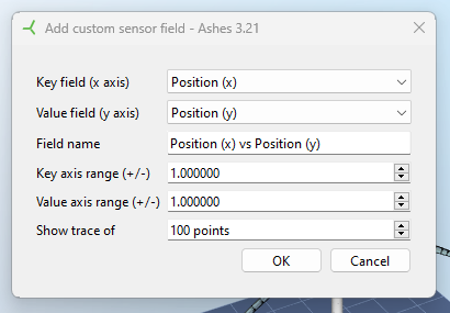
The settings are as follows:
- Key field is the field that will be plottd on the x-axis in the graph
- Value field is the field that will be plotted on the y-axis of the graph
- Field name is the name that will appear in the field list in the sensor pane, and as the title of the graph
- Key axis range will define the range of the x-axis in the graph. The graph will always be centered on the current point at any given time step, and the range of the x-axis will be defined as the x value +/- the key axis range
- Value axis range is defined the same way as the key axis range for the y axis
- Show trace of defines how many data points are plotted on the graph. If the tie step is 0.025 s and the trace is set to 100 points, at any given time, only the last 2.5 seconds will be displayed in the graph.
Note: The option to add custom field is not there for sensors that don’t have at least 2 scalar fields. This means that they cannot be used for sensors such as the
Blade [Span] sensor or with fields that output strings such as the
Loads with inf magnitude of the
Solver sensor